
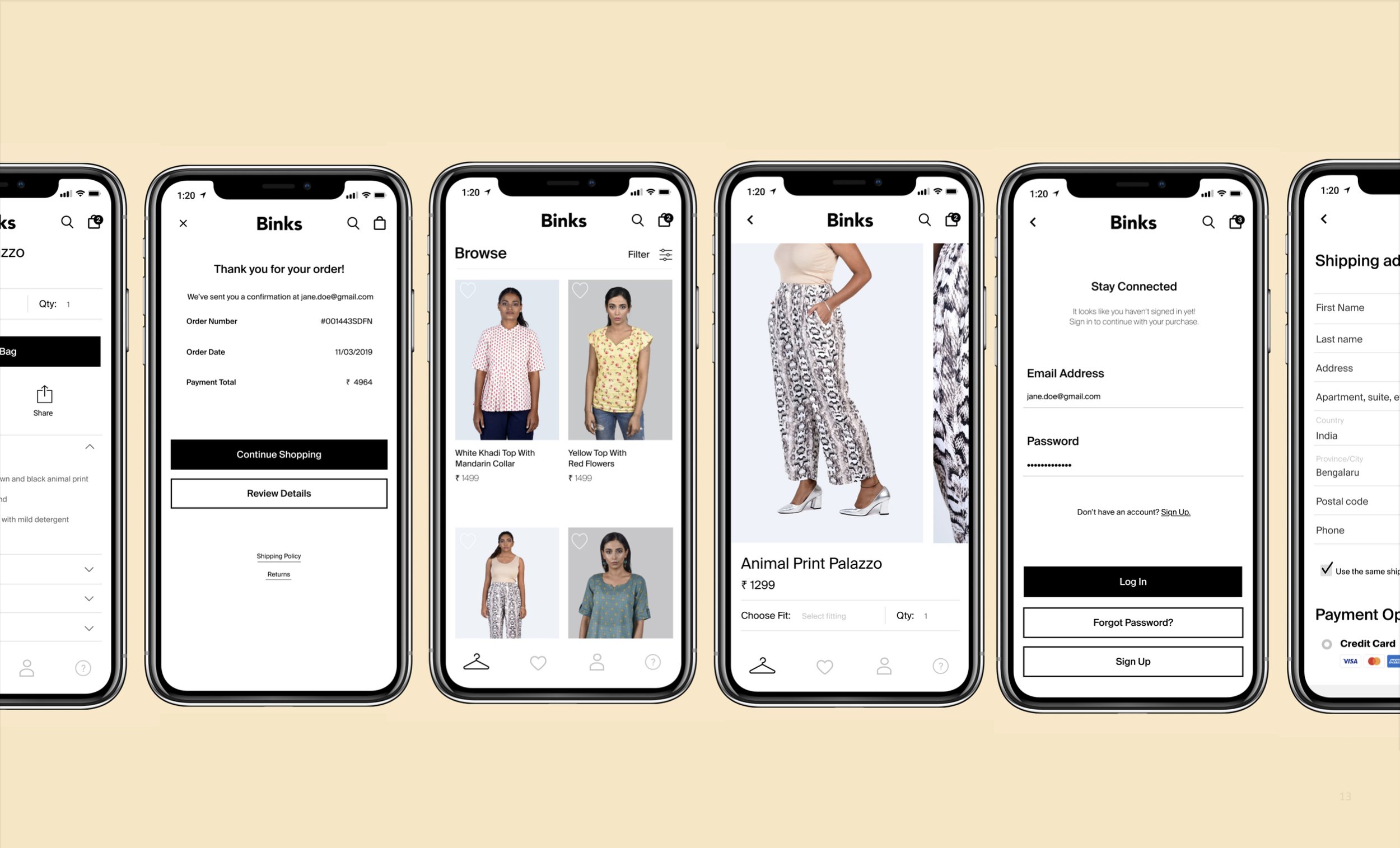
Binks Interface Design
(Case Study)
Overview
We designed a mobile app interface for Binks, an emerging clothing startup based in Bengaluru, India.
Project Timeline
3 weeks
Role
Visual + UX Designer
Team
3 Students
Binks is a start-up founded in India. It aims to streamline the tailoring process for both tailors and customers.
Background
What is Binks?
Binks is a custom clothing startup based in Bengaluru, India. Started in 2019, its co-founder and CEO Aamna Khan realized how frustrating it is to find well-fitting women’s workwear in Indian cities.
Binks solves the problem by using computer vision and machine learning to provide customers with clothing sewn to their measurements and shipped in just three days.
While their business model and goals are something that we were excited about, like any startup, Binks is still not well known. How can we, as designers, make an brand new interface that could help a startup like Binks reach their goals?
Pre-Design Considerations
Choosing an interface
In its mission statement, Binks claims to target the urban, “modern woman”. Our research found that India has an accelerating number of mobile-first internet users. It would also be convenient for Binks users to take photos directly from their mobile devices, given the camera quality on phones today, as part of their ordering process
Who would be impacted by our interface?
Directly impacted: Indian women who order tailored clothing.
Binks would ease the process of acquiring custom-fitted clothing through the convenience of an app, and significantly save time otherwise lost through the traditionally tedious process of tailored clothing.
Indirectly impacted: Local Tailors/Small Businesses
This group could be negatively impacted by the interface as Binks could disrupt the traditional market and cause a loss in customers.
Design Process
Sketching and Ideation
Members of our group rapidly made sketches to visualize our ideas for specific goals.
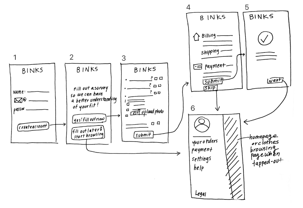
Goal: Create Account
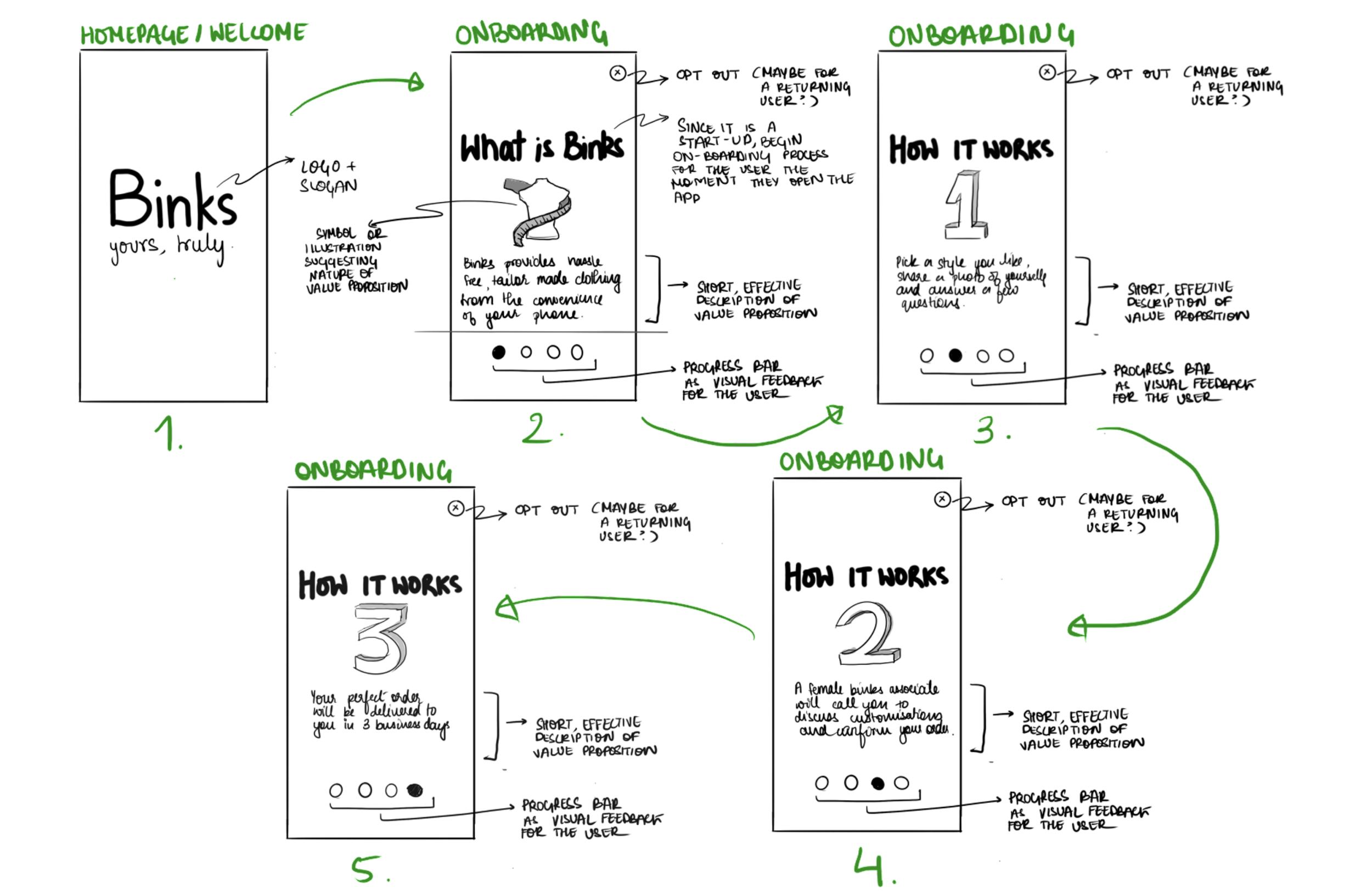
Goal: Introduce Binks (Landing Page)
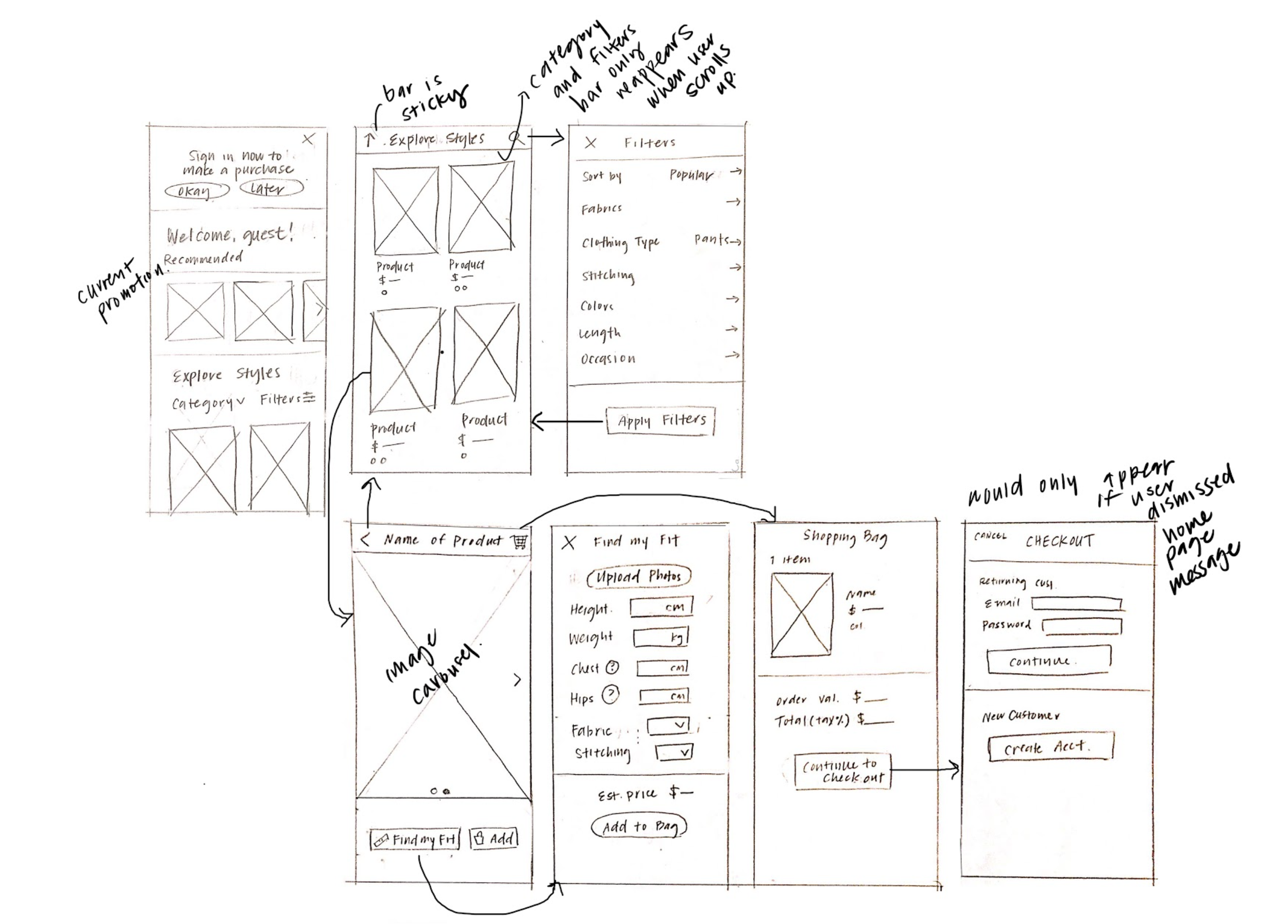
Goal: Add item to cart
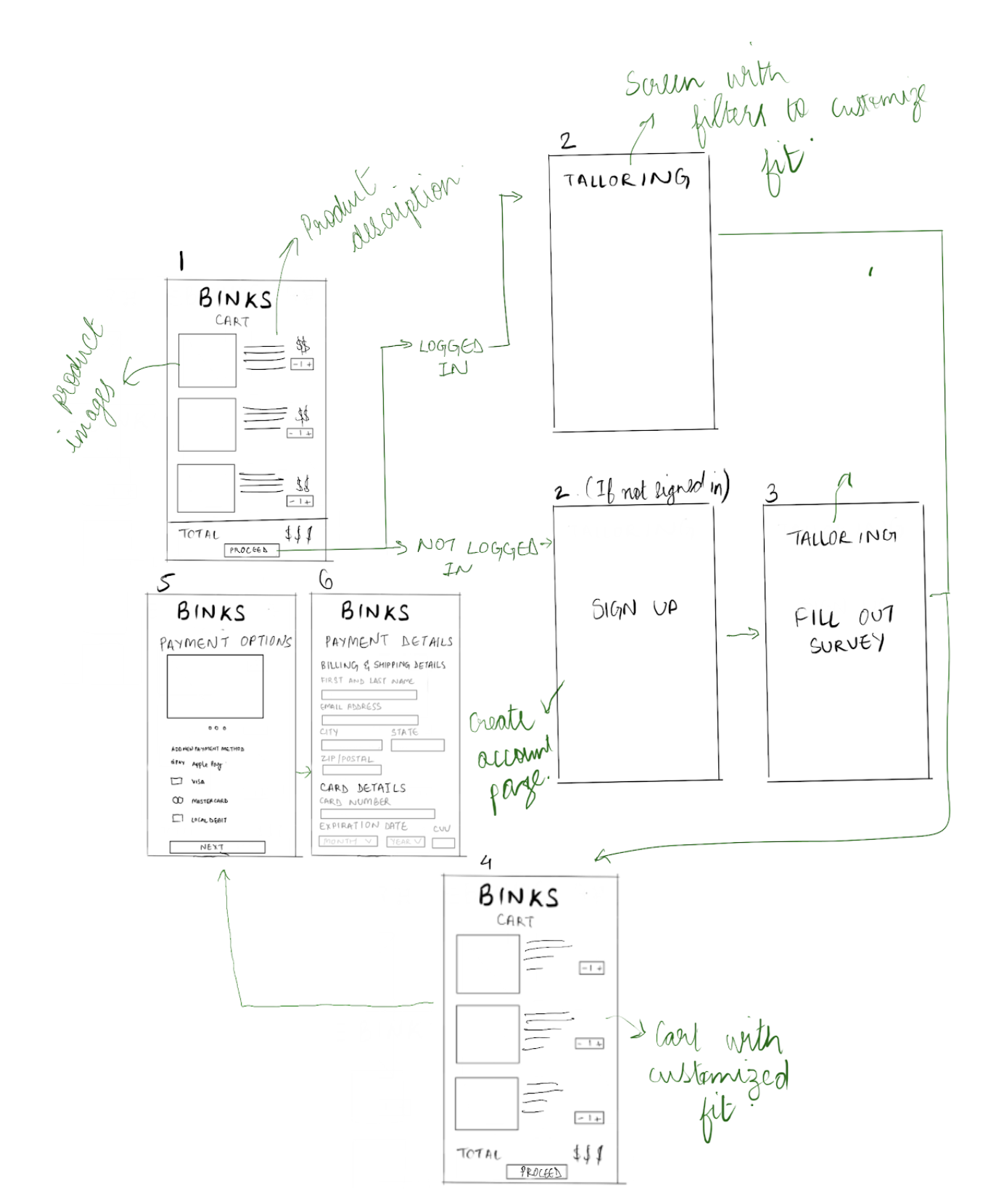
Goal: Buy a product
Using these sketches, we brainstormed together to create a cohesive design incorporating and improving upon our individual ideas.
Hi-fi Mockups
For our hi-fi mockups, we decided on a minimal, visual aesthetic in order to achieve efficient navigation while highlighting products. Color was used selectively to provide visual feedback. The logo is consistently visible to add to brand-memorability and experience. We created our high-fidelity mockups in Figma.


